One of the simplest models of stock prices is geometric brownian motion (GBM). This model gives rise to the idea of characterising a stock's performance by its mean annual return and volatility - which most of us are very familiar with.
But do we have a good grasp of what different values for volatility feel like? How much volatility are we comfortable with in a stock?
From the model you can derive several theoretical results about things like the expected drawdowns and likely daily movements, etc.
However, sometimes it helps to just see the effects of different values for these parameters in reality.
So here is a simple simulator of GBM which can be run in Excel/OpenOffice/LibreOffice. I can't post attachments so it is in the form of a table which you should be able to copy and paste into a spreadsheet starting at cell A1. You will then need to make a couple of quick modifications and the simulator is ready to go. The instructions are at the end of this article.
If you do it right it should look like this:
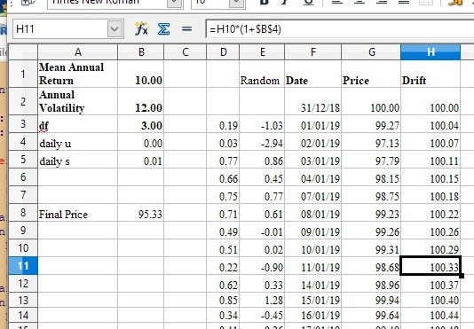
Each time you press F9 the simulator creates a year's worth of stock prices based on the values you supply for mean annual return, annual volatility and df. We'll come to df later.
If you set the volatility to zero you will see that the prices simply rise smoothly to achieve the desired final return. In fact I have included a "drift" column which plots this result as well as the stock price as a guide to the "underlying" behaviour.
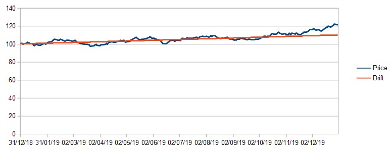
Now change the volatility to (say) 12 (for 12% annual volatility). This is similar to the volatility of a 20-stock diversified portfolio such as NAPS. You will see that the stock price follows the drift reasonably closely. Every time you press F9 the simulator creates a new set of random numbers and a different solution - but they all follow the drift reasonably closely.
Low Volatility example
Now try a value for volatility of 50. This is similar to Fevertree Drinks (LON:FEVR) or Burford Capital (LON:BUR) . The price will swing wildly away from the drift.…