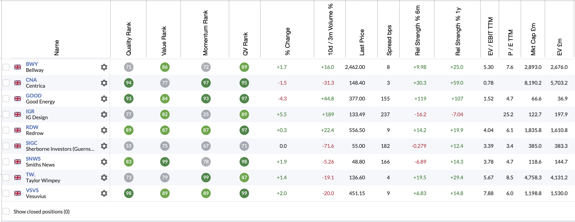
Have suggested it before, but maybe a graphical illustration might be better. Would be great if we could go from this

to this

This would allow rows to be narrower, which would get rid of unnecessary white space and would allow a lot more information to be visible on the screen. Also, it would be great if the headings in the top row were fixed as we scroll down the table...


